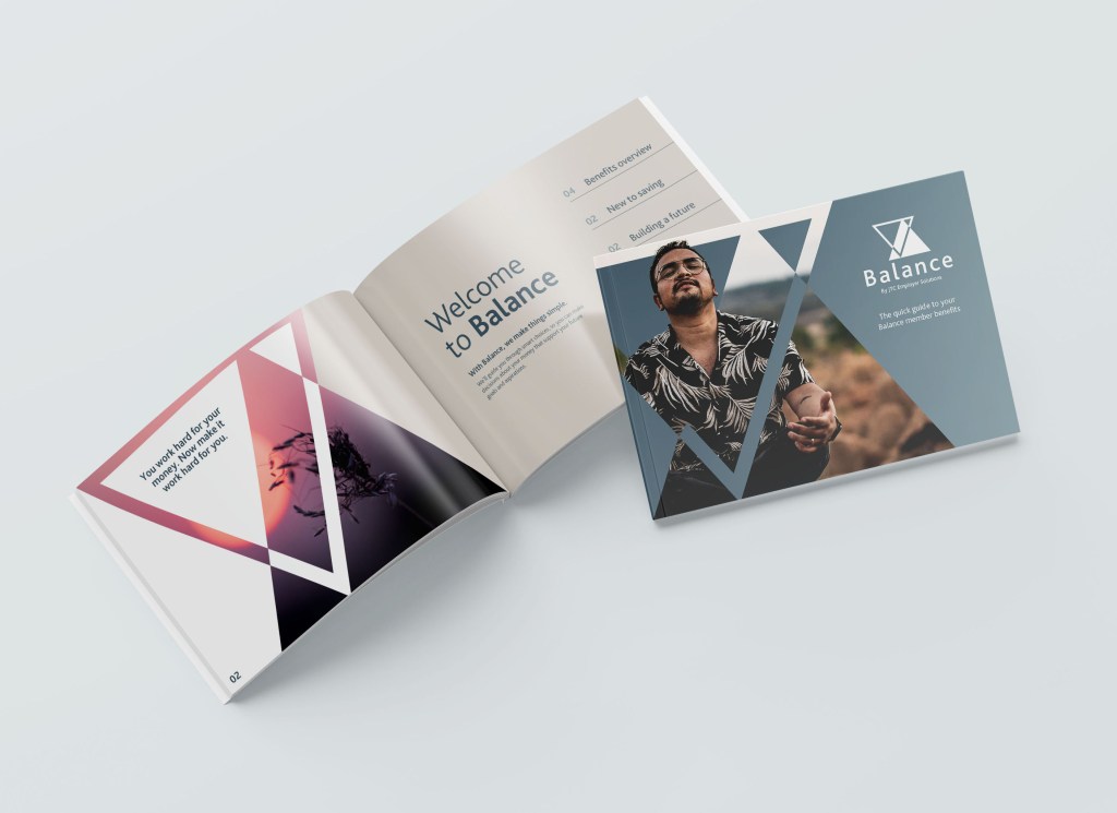
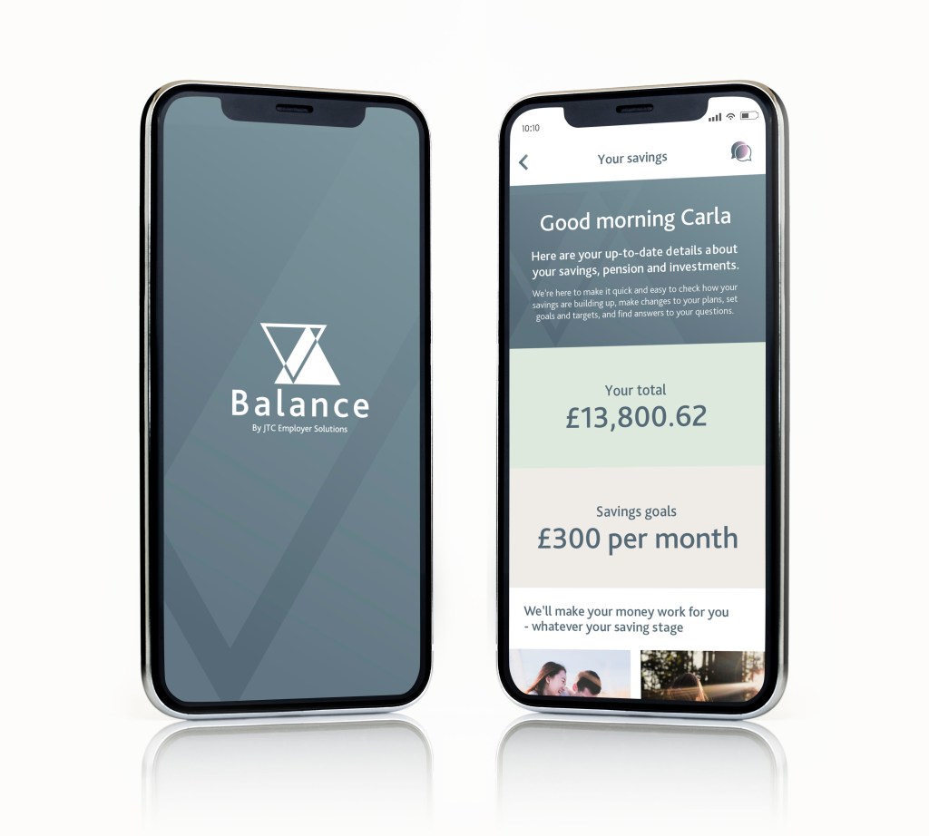
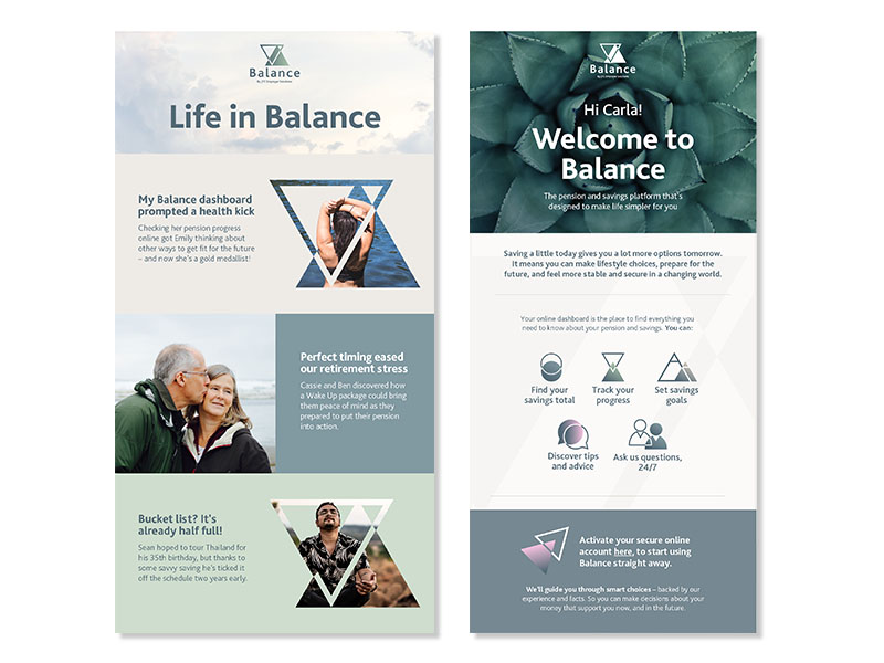
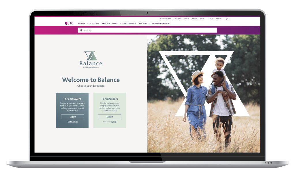
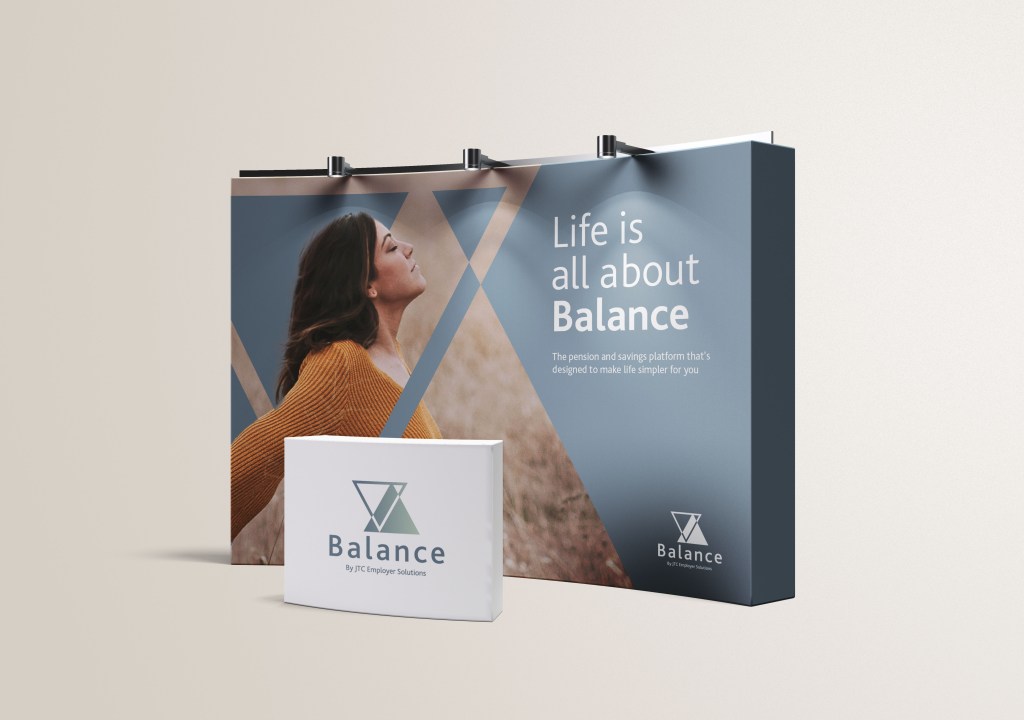
A refreshed visual identity for an employee pension platform aiming to make life simpler for clients, ensuring a secure and rewarding future.
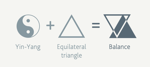
Taking inspiration from well known cultural symbols of balance, the yin yang and equilateral triangle merge together to form the logo mark for the brand. Balance is not just a play on words, but a symbol of financial wellbeing and stability.
Client
JTC
Project
Brand identity